Neighborshare
Project Overview
Neighborshare helps people find and borrow items in their local area
My Role
This is a personal project for Designlab that took 1 month to create. I worked on User research, Design, Wireframes, Prototypes, and User Tests.
The Problem
The Solution
In the world of consumerism, shoppers are buying unnecessary items that they will use for a few uses which leads to wasteful consumption and stress from clutter and financial strain.
Create a website that allows accessible sharing and borrowing items for profit between neighborhood communities for easy access.
Discover 01/06
Research
I asked my self… Where do I start? Well, my first step for this project was to understand the problem, needs, and behavior for the users to create a better user experience.
Who are my competitors?
I started off with assessing competitors’ products to understand what works and what does not work for the users. From the competitive research, I realized the platforms had a lot of advantages and were doing well in creating engagement, access to wide variety of items, and convenience, but lacked a few things such as chance for market expansion, pricing, availability, and inventory… which I’m sure they are aware of as well?
Who are my users?
My next step was to conduct interviews with people who borrow items regularly from neighbors. From the interview, I found that many people rely on their neighbors not only for borrowing but to create a sense of trust and community in order to help each other out when needed. The interviewees mentioned great points about how they like borrowing items to save space and to save money. I was glad to get good responses and I was even surprised with some of their answers. They actually influenced me to make good connections with me neighbors (:
Who is my target audience?
From the interviews, I developed simplified versions of personas that represent our target audience in order to understand potential behaviors, needs, and pain points.
Define 02/06
Despite conducting interviews and creating personas, I struggled to pinpoint the specific painpoints experienced by users due to many different responses. To address this, I organized the user's requirements into a condensed format, helping me in getting a clear understanding of the core issues and areas of emphasis. This process led me to recognize the necessity for a way that enables borrowers to conveniently request items and ensure timely returns, ultimately promoting an optimal borrowing experience.
Ideate 03/06
Now that I finally understand the users and the painpoints, I started my process to design the website and add features for Neighborshare. I wanted to focus on creating an easy borrowing experience and allow access to wide variety of items where users do not feel like they are limited to a certain category and can explore variety of options to test out and use for their needs.
Based on the personas, I asked some questions to myself..
How might we ensure trust between borrowers?
How might we create a way for lenders to get their item back?
How might we make the borrowing expereicne as simple as possible?
These questions will help me focus on the end goal for this project.
What steps should users take to achieve their goal?
I created a task flow to illustrate user engagement and experience with the website. The tasks includes: Signup, request hammer to borrow and ask lender about where to pick up hammer.
Design 04/06
The fun process starts here! I started to assign brand colors based on color psychology. I also wanted the users to feel like the Neighborshare website is safe, comfortable, welcoming, and non overwhelming, which colors can take a big role in doing so!
Logo and Color Palette
After testing out multiple color palettes, shades of green were chosen as the brand color since those colors are associated with safety and the environment. (As cliché as it sounds…but if it works, it works!) The Neighborshare website needs a sense of safety for both lenders and borrowers to confidently use the website and ensure that the lender’s item is safe and that borrowers can rely on the website to temporarily use other people’s stuff. While I was creating the logo, I thought about boxes as a way to represent the wide variety of items users will borrow and interlaced the boxes to represent connection and trust between neighbors.
Font
The font Poppins was chosen for its clean and modern style.
Wireframes: Sign up
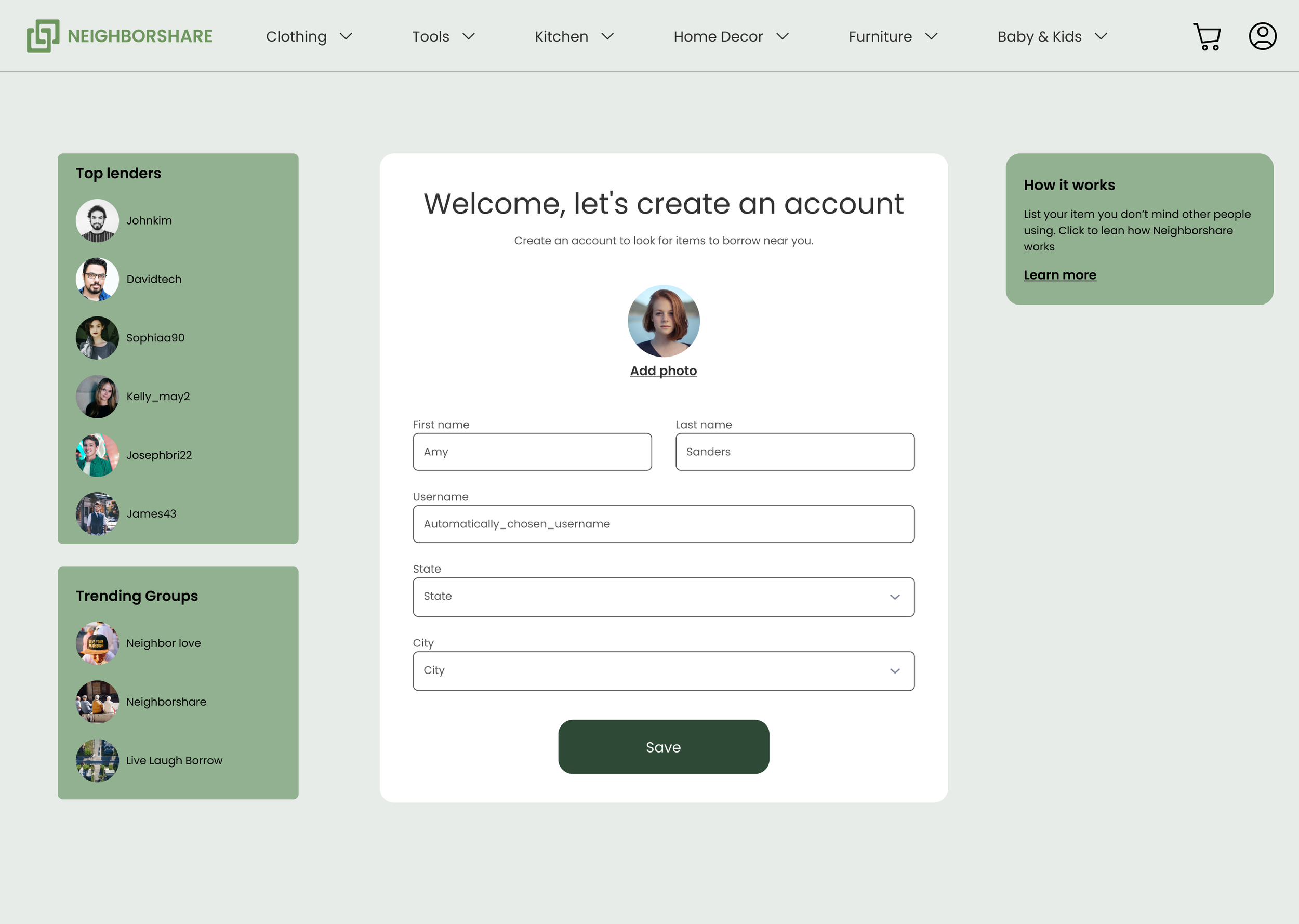
First, I came up with the welcome page and thought about how users would sign up. My main struggle with creating a website was using all the white space effectively. I did not want to place a big image, but I wanted to place something meaningful or just nothing at all. Therefore, in the welcome page I decided to place popular items category for users to see what is trending or special deals that happened and some general information about the Neighborshare website. The signup page has been changed into a mini tab above the welcome page to avoid placing unnecessary images that could lead to confusion. This way, users can easily exit out and still be on the home page. The create profile now has top lenders section and trending groups as a way to show a preview of what the users will expect.
Wireframes: Browse Item
Next sets of wireframes show the browsing page. Users will simply hover over the categories and find the item they are looking for. They can apply filters to make their search more simple. Users will be able to see the distance they would have to drive to meet the lender, price, description. Once the user clicks on the item, they can easily message the lender and set the dates they are planning to borrow the item for. The page also shows the lender’s ratings and history as a way for borrowers to ensure trust.
Wireframes: Checkout
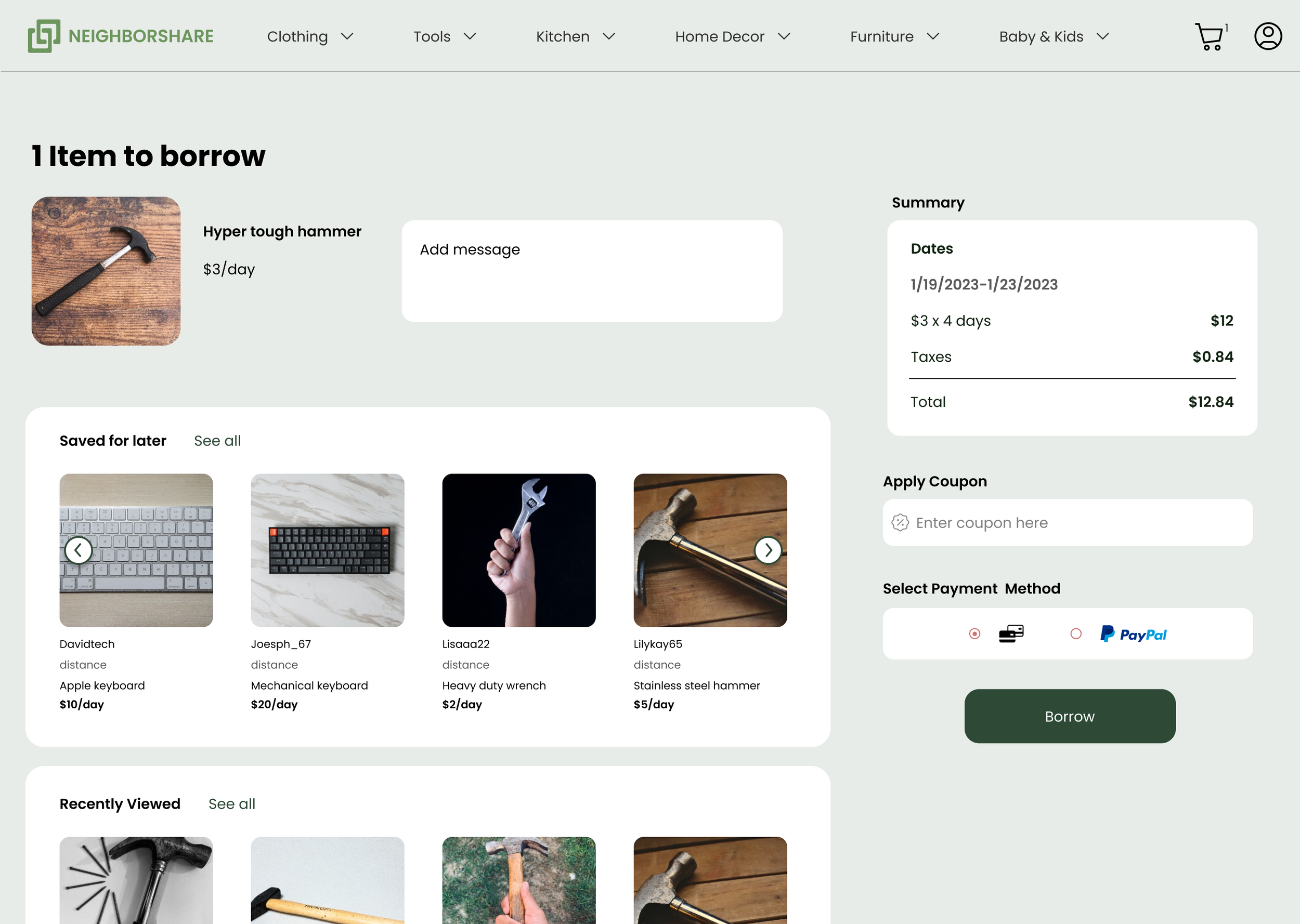
The checkout pages had a drastic change from beginning to end. I added some ways for buisnesses to possibly convince users to borrow more items by showing what they recently viewed and save for later items to remind them about the previous items they were interested in. The payment section was also simplified because the personal information was already asked during the signup process. After users checkout, they will end up on the final page with finalized summary about their items.
Usability Testing 05/06
For the final part of the research, I asked 11 users to individually test the app to see their reaction and whether the tasks can be finished with no confusion while meeting user expectations.
Task Assigned
Create account
Look for hammer and send message if the hammer is available
Choose dates
Add to cart and checkout
Feedback
Although most participants said the tasks were pretty straightforward, there were some feedback:
Unclear if item was added to cart
Final Design 06/06
Quick Reflection
Balancing Visual Design and Functionality
My initial focus was heavily centered around crafting a visually pleasing experience, but I soon realized that prioritizing aesthetics without a solid foundation of functionality can impact the overall user experience. Seamless integration of functionality is an integral component of delivering an exceptional user experience. It became obvious that my focus on visual design sometimes overshadowed the need for functional navigation, efficient task flows, and user-centered interactions. Through this process, I learned that the beauty of design is not in its appearance but in the ability to create meaningful and functional user interactions.
Prioritizing problems
From background research, there were up to 5 problems people faced when trying to borrow items and trying to solve for all 5 problems in one project was starting to confuse me and making me change my ideas which means I would have to invest more time into the project knowing I have one month to finish. When I decided to solve for one or two main problems that made the design process easier and less confusing and overwhelming.
Working with time management
Even though I had a month to work on this project, I tried to work under a month in consideration for any iterations based on feedback and user testing. This also meant to not become too attached to my design until I finalized my thoughts and results.
Having an efficient and organized design system
Creating an effective design system early on helped save time tremendously.


