Spotify Friend’s Activity
Project Overview
Bringing Spotify’s friend’s activity feature onto mobile
My Role
This is a personal project for Designlab that took 3 weeks to create. I worked on User research, Design, Wireframes, Prototypes, and User Tests.
The Problem
The Solution
The friend’s activity for Spotify currently exists only on desktop but is very vague and only shows the music and playlist people are listening to. More can be done to get to know your friends better through music.
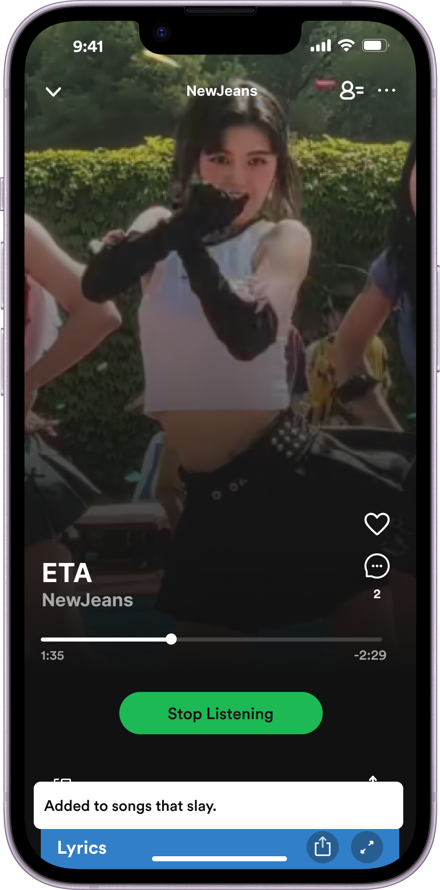
Expand the friends activity feature onto the mobile app. If you notice that your friend is listening to music and you're interested, you have the option to join them and listen together at the same time at any time! You can also chat on the Spotify app about the song instead of having to go to another messaging app. These features can help users discover new songs and increase user engagement on the platform as users are exposed to wider categories of content. These settings can be turned off.
Discover 01/06
Who are Spotify’s competitors when it comes to friend’s activity?
I first looked for existing apps that uses friends activity feature. I realized this feature is not very common, so I decided to find apps that somewhat has a social feature integrated into their product. From the competitive research, I realized that there are a lot of pros based on creating a profile and creating ways to discover new music, however the social features are limited and has a lack of user engagement opportunities.
Who are my users?
My next step was to conduct interviews with people who uses Spotify and is familiar with the social features that exists within the platform. It really struck out to me that many people said they are curious what their friends listen to and are able to learn about their personalities better.
Who are my target audience?
From the interviews, I developed simplified versions of personas that represent the target audience in order to understand potential behaviors, needs, and pain points.
Define 02/06
In order to organize my design focus better, I condensed the painpoints to come back to. Users mentioned they are having trouble with the current collaborative features and that they want more ways to discover new music.
Ideate 03/06
My next step was to start thinking about how the added friends activity feature would work on mobile. I wanted to focus on creating a simple and fast way for users to see their friend’s activity. Despite adding this new feature, I wanted to make sure Spotify does not lose its main purpose as a music streaming app and turn into a social media based streaming service.
Before coming up with the idea for the feature, I asked my self..
How might we make the new friends activity feature easy to discover?
How might we make the friends activity feature engaging and fun for users to continue using?
How might we create a platform for users to discover new music and engage within the app?
These questions will help me with the end goal for the feature.
What are the steps users should take to achieve their goal?
Keeping the “How might we questions” in mind, I created a task flow to understand the steps needed to reach the end goal (joining a friend’s song).
Design 04/06
Logo, font, and color palette
This process was not too difficult since I am just taking out fonts and color that already exists (in dark mode).
Wireframes: Home page
First, I thought about where to place the friend’s activity icon… the left side? or right side with other icons? I decided to place all icons together, that way the icon feels cohesive and not like a separate feature
Wireframes: Friend’s activity page
Now it was time to think about how the friend’s activity page would show up. Would it be best to slide from left or right? Would it be effective for the activity page to not fill the whole screen so that users do not feel like they are stuck on this added feature? Would a circle profile picture work better? Would a square song album cover be better since that is more focused on the song they are listening to? At the end I decided to just fill the entire screen to follow the Spotify UI patterns and use profile pictures to easily indicate the friend. There will be green outlines to show the friend is currently active with another icon on the right that shows the friend indicating they are listening to music.
Wireframes: Music listening page
This part is where I struggled the most. I wanted to add more icons to make this feature interactive and fun, however I realized my initial layout idea does not feel like Spotify anymore and the page would feel too different. I tried to go along with the regular Spotify UI patterns and I decided to add few icons that are common in social media apps like comment, like, and the people listening icon to see who is actively listening together.
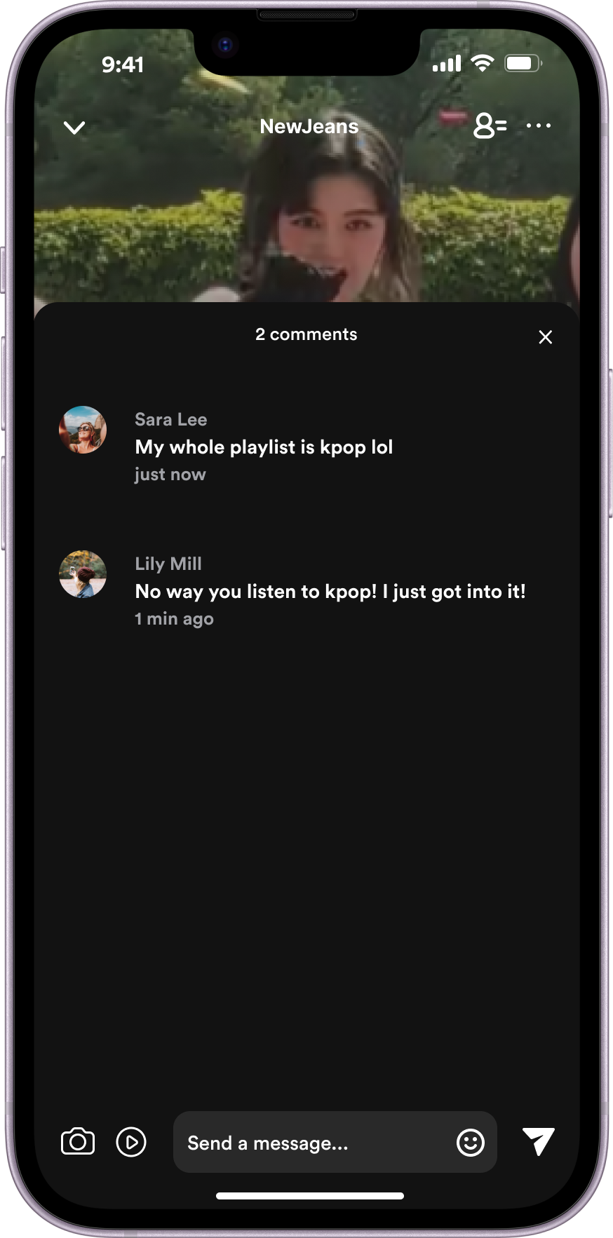
Wireframes: Comment section
The comment section follows a similar UI pattern. The user will simply click on the chat icon.
Usability Testing and Revisions 05/06
For the final part of the research, I asked 12 users to individually test the app to see what needs to be changed and if there were any confusion.
Task Assigned
Go to friend’s activity tab
Go to Sara’s activity
See who joined Sara’s activity
Positive Feedback
Although most participants said the tasks were pretty straightforward, there were some feedback:
11/12 users say the friends icon was easy to find and easy to join Sara’s activity
10/12 users mentioned they felt like they could successfully engage with their friends by co listening and leaving comments.
3 people also mentioned they feel it is more reasonable to put on the home page since it is an optional feature and they prefer to listen to their own music most of the time, which I was happy to hear :D
Revision Feedback
6/12 users say they got confused with the active listeners icon since it is the same icon as the friends activity icon. They thought they would go back to friend’s activity page.
2 users felt like the feature is isolated and not much collaborative features are in the friends activity page.
“Joined friends” revision
After getting feedback about how the active listeners icon, I decided to change the icon and add a tutorial page so that users can be informed and prevent any confusion.
Comments section revision
After getting feedback about how the feature feels isolated, I added more activities users can do such as sending images, playing mini games, and sending emojis and gifs.
Final Design 06/06
Quick Reflection
Designing based on the existing branding color palette and UI patterns
When I began sketching out my ideas, I realized that the UI patterns did not match Spotify and could be confusing for existing users and will not feel cohesive. Although I had this original feature idea in my mind, I had to minimize my idea to match what Spotify already did in their platform and not create any new UI patterns.
Choosing Icons thoughtfully
Although the icons seems pretty clear to me, I realized how users became confused with what the new icons meant. This could be adding a tutorial text to explain what the icon is for or choosing a more commonly used icon that will be familiar for users.


