Roomify
Project Overview
Roomify is an app that turns the process of finding a roommate into a more trendy and fun experience.
My Role
This is a personal project for Designlab that took 1 month to create. I worked on User research, Design, Wireframes, Prototypes, and User Tests.
The Problem
The Solution
Looking for a roommate has multiple risks to consider like safety, honesty, and getting to know the person in a timely manner.
Create a modern roommate searching app that allows users to discover their perfect roommate using the algorithm, using videos to ensure trust and to get to know the person better along with other recommended questions to answer.
Final Features
Main features that makes Roomify unique!
Video Recording
The unique part about Roomify is that the app is a video platform where users will post a video answering a prompt about themselves for users who are searching for a roommate to get the feel about the person’s vibe, authenticity, honesty, and personal information.
Pre-made prompts
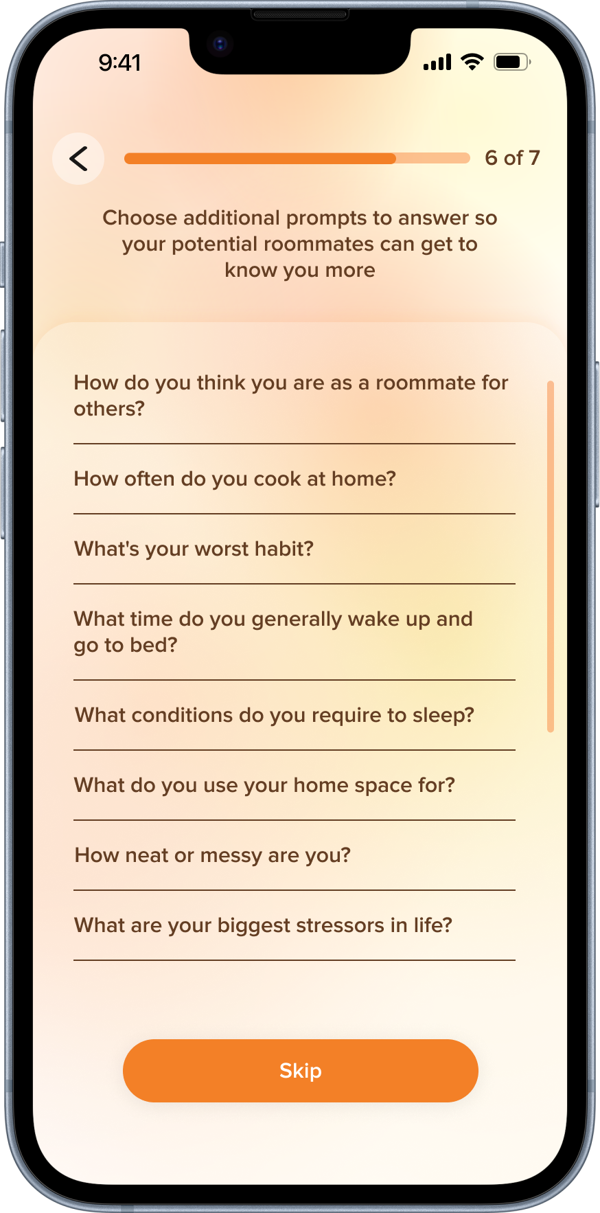
There are already a list of questions for users to answer so they do not have to worry about what questions to ask or what information to tell about themselves.
Home
The homepage displays numerous user videos seeking roommates, using an algorithm to quickly match and present preferred roommates, with the option to focus on favorited "Roomies."
Instant messaging
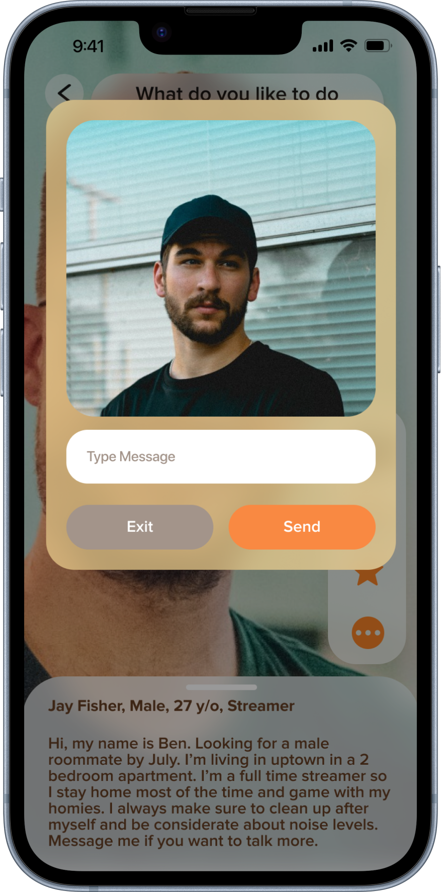
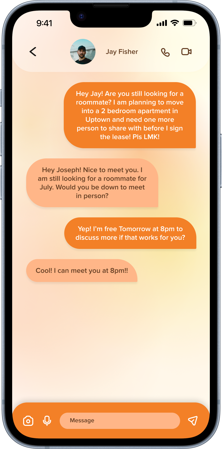
See a potential roommate? Just click the message icon and send a message instantly!
Discover 01/06
What are the current trends for existing products? What could I do better?
First, I did some competitive research and looked for existing roommate searching apps to see what I can do better. There were a lot of pros that helped users find roommates, however things like safety and roommate matching were a common issue. Although there were a lot of users who claimed to be “active” roommate searchers, I was unsure whether they were genuine and were legit. There was no way to check without actually seeing them in person… This was from my observations and my next step was to ask my potential users problems they face and experiences in roommate searching.
What are the User’s painpoints?
I looked for people who lives with roommates and experienced searching for the ideal roommate in the past. I wanted to understand their process, painpoints, concerns, emotions, and resources they used during their roommate search. This information will help me understand the problem and come up with a solution for users. Overall, I got similar answers about their struggles which was mainly about getting to know the roommate before actually moving in together. This could be not knowing what kind of questions to ask, making sure all questions were answered, and a way to get to know the roommate fully and feeling confident about knowing if they will be a good or bad fit.
Who is my target audience?
There were a lot of information from the interviews, so I developed simplified versions of personas that represent the target audience in order to understand potential behaviors, needs, and pain points.
Define 02/06
Next, I condensed the painpoints to come back to. Users mentioned they want to know what questions to ask and able to get to know the person quickly. This will help me later on during the design process to remind myself the problems to focus on.
In order to organize my design focus better, I created an empathy map from user personas that shows how the users feel, think, does, and wants. The empathy map really helps me understand the users emotionally about their expectations.
Ideate 03/06
What steps should users take to look for a roommate?
My next step was to create a task flow to start thinking about how Roomify would work on mobile. Although I realized the Sign up process would be long, the app would need detailed information about the user to match them with the right roommate. The second task shows how the user would send a message to a potential roommate which has to be as simple and quick as possible so they can continue to look for roommates in a timely manner.
Design 04/06
Moodboard
I had to think about how the app feels and start coming up with a color palette. I focused on the three words: Energy, Friendly, and Lively. I then did some research and found that colors orange and yellow has pshycological effects of making people feel happy and energized. I decided to go for a warm color palette.
Logo, font, and color palette
The goal was to choose colors to make users feel energized and social. I chose shares of yellow and orange along with brown as accent colors.
Wireframes: Sign up process
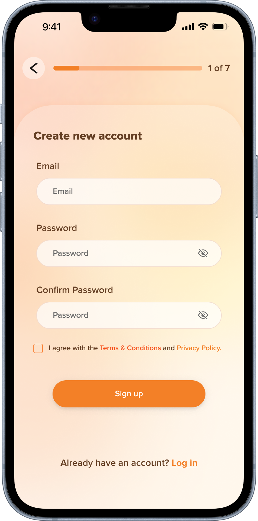
This was the initial start of the signup screens where users are welcomed with what Roomify is. Once the user clicks sign up, they will fill in their personal information and go on to the next steps. Although I wanted the signup process to look simple and non-overwhelming, I realized then users will have to click through too many steps in the signup process. I thought about how to minimize steps and making the welcome page more modern.
I decided to change the logo because the previous seemed like a mastercard logo and was feeling outdated and the sharpness did not match the overall visuals of the screens. I decided to combine some signup information to decrease the number of screens needed to signup. Semi transparent cards and boxes were added beneath as a visual way to chunk information needed from users.
Wireframes: Sign up process continued
Next screens show the last few steps of the signup process. My main concern was the recording page. How could I include diff icons commonly found in other video apps without feeling too cluttered or copying exactly from existing apps? I also decided to have optional signup steps towards the end in case users feel like they spent too much time filing in all their information and could come back later and fill out the missing information.
In the recording screen, I decided to include icons necessary (found from card sort) and keeping the prompt on the screen for users to know the topic of the video. The prompt will be moveable by dragging around and repositioning for better visibility of the person in videos.
Wireframes: Home page
This is the initial wireframes for the homeppage and how all the information about the potential roommate will be laid out. I was worried about the visibility of the video from the boxes getting in the way. Since not all of the information can be shown on one page, users will have to swipe up to see more information (photos, additional prompts, caption)
I decided to follow the previous visual patterns with the semi-transparent background. I wanted the overall colors and visuals to feel cohesive so there are orange and brown as accent colors.
Usability Testing and Revisions 05/06
For the final part of the research, I asked 19 users to individually test the app to see what needs to be changed and if there were any confusion.
Task Assigned
Sign up
Look for potential roommate’s detailed info
Send potential roommate a message of interest
Positive Feedback
Although most participants said the tasks were pretty straightforward, there were some feedback:
Contrast between icon and image is hard to see in the home page.
Message icon is too similar to share icon.
Revisions
The feedback I got from user testing was helpful. I just change two things users mentioned from user testing.
Final Design 06/06
Quick Reflection
Designing and creating components and screens for developers
I realized that I can make a screen look like how I want to look, but if the background or components are not correctly created as it should be for developers, that could lead to issues and confusion and extra time to fix. I have to stick to a nice organized method when creating components to prevent issues after the wireframes are created.
Choosing Icons thoughtfully
Although I can come up with my own meaning for existing icons, I understand how that could lead to confusion as users are already used to a certain meaning for icons.
Meeting deadlines
I had one month to work on the project. I struggled a lot with time management in the beginning with other projects, especially in the ideation phase because I would get overwhelmed and confused trying to get ideas and inspiration from other apps. Through this final project, I was able to find ways to manage my time and finish on time on a weekly basis. I listed out everything to complete for each day and leaving one day to catch up in case something happened and I was unable to finish on the day of. It was fun and rewarding to cross out tasks done each day and seeing my project come to life so quickly! I also got helpful tips about searching for inspiration images that matches with keywords/goals for the project.
Making consistent visual designs
There were some screens (camera recording screen and and home page) where I had to think about keeping consistent visual balance with other screens so that they can all feel like one cohesive app. I tested out with colors from the color palette and asking users for suggestions.


